Two palette directions
Brown vs. green colored contacts
Brown and green can each lead to several different looks. Instead of choosing one family as automatically subtle or dramatic, compare the specific pattern and the contrast you want beside your usual makeup.
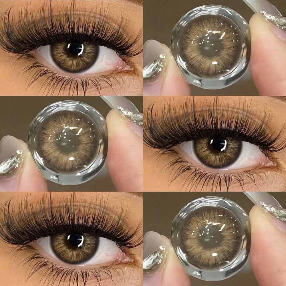
Start with a palette rather than a rule about skin tone
A warm eyeshadow, dark brow or cool-toned wig can change the way a lens color fits into the whole look. The same shade can be a focal point in one makeup palette and a smaller detail in another. There is no universal rule assigning every complexion to brown or green contacts.
Keep a reference photo of the makeup you actually plan to wear, then shortlist one brown and one green product. Compare the lens photographs beside that palette. Product images remain references rather than a guaranteed preview of your own eyes.
Use hazel and olive as comparison points
Catalog names such as hazel and olive can suggest mixed-tone directions between the broad brown and green families. They are not standardized formulas. Look at the printed center and outer edge instead of assuming a hazel lens must contain a particular amount of green.
For example, compare Coffee Ring Brown with Olive Sand Hazel, then view Olive Petal Green and Fresh Mint Green. These are separate products with their own images; their names do not establish equivalent coverage, material or fit.
Compare the edge and center at the same scale
A dark border can make a pattern appear more defined in a photograph, while a gradual transition can give a different impression. Either feature may occur in brown or green designs. Compare similar crops so a close-up is not mistaken for a stronger real-world effect.
Your natural iris and the photograph's light source also matter. If you have dark brown eyes, use the dark-eye comparison guide and ask for missing product information. A light-looking center in one photo is not a measured opacity specification.
Keep a two-product shortlist
- Choose one product from each family and keep the exact SKU available.
- Compare the print, border and pupil opening in clear photos.
- Consider the full face and planned lighting rather than an isolated color swatch.
- Confirm your prescribed product and its actual specifications before ordering.
Read hazel versus brown for more warm-tone context, or mint versus emerald for another green comparison. Styling preference does not establish fit; US prescription and professional fitting requirements still apply to decorative contacts.
Explore the products in this guide
These are separate product photographs and may show different wearers and lighting. Use them to compare the actual designs, rather than as a controlled test or a guaranteed result on your eyes.
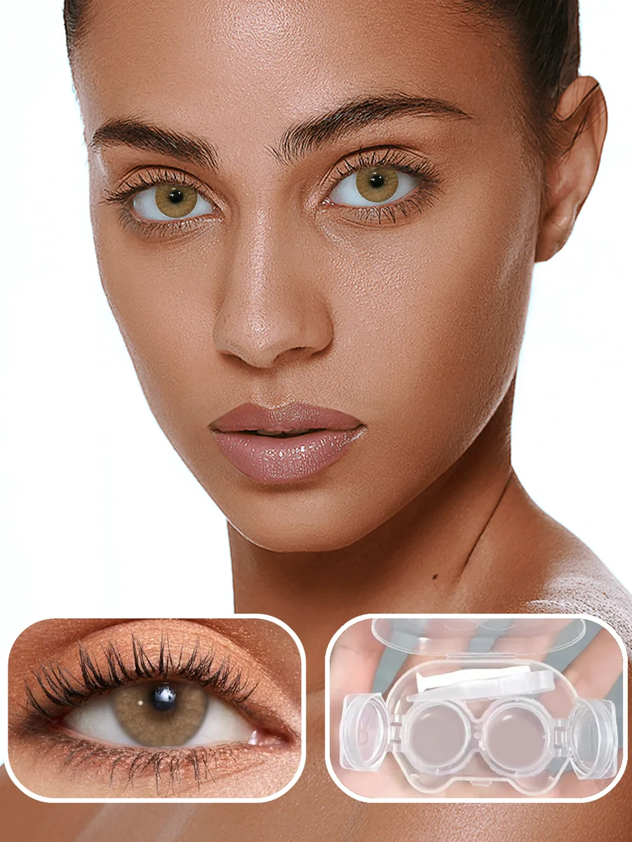
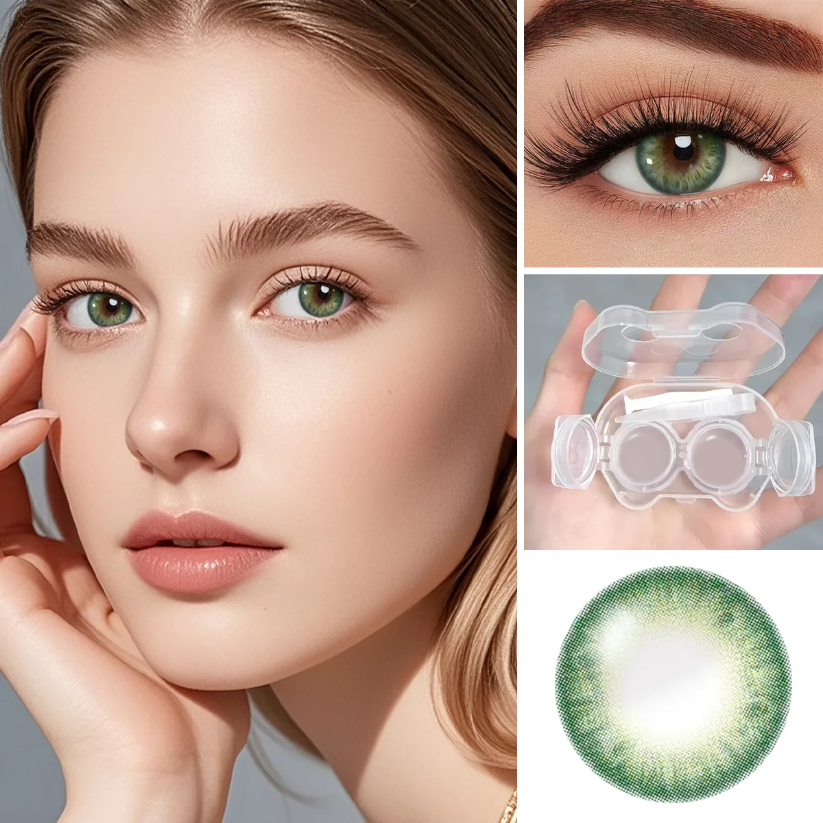
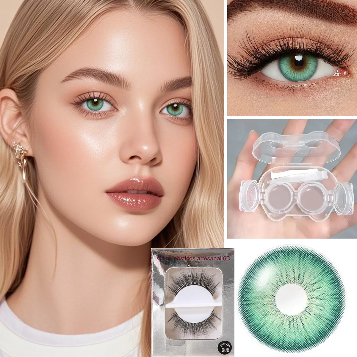
Quick Answers
- Are brown contacts always more natural-looking than green contacts?
No. Contrast with your iris, the printed pattern, the outer edge, lighting and your makeup influence the appearance. A color family is a browsing direction, not a guarantee of a natural result. - Should I choose brown or green contacts by skin tone alone?
Skin tone can be one styling reference, but it does not determine a single correct contact color. Compare actual products beside your usual makeup, brows and hair color, and separate that visual choice from professional fitting.
Sources and further reading
Official references for prescription, fitting or care information. Color comparisons are editorial guidance, not clinical advice or product wear tests.